CNC Condition Monitoring
Using RMS and Crest Factor Together for CNC Monitoring
Combine overall vibration energy with impulsiveness and learn why the same RMS can describe different waveforms.
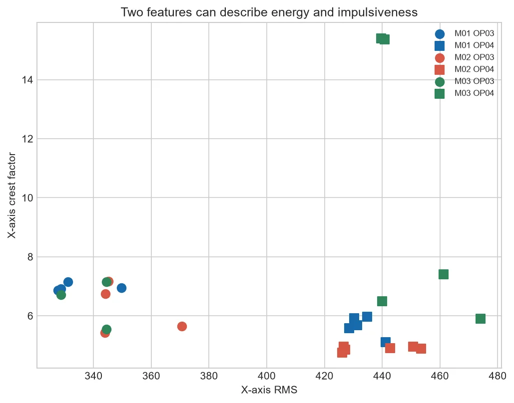
RMS measures sustained energy; crest factor compares the highest excursion with RMS. Plotting them together separates two questions that one feature cannot answer.
Four broad regions
Low RMS/high crest suggests sparse impacts; high RMS/lower crest suggests sustained vibration. These are descriptions, not fault labels.
Machine and operation effects
Points may group by machine or operation before condition. Color them during analysis to expose this confounding.
Threshold design
Rectangular limits are simple; distance or density methods can follow the healthy cloud. Both require sufficient reference data.
Explain every alert
Show RMS, peak, crest factor and waveform around the event.
Interpret two points
If RMS doubles while peak stays similar, crest factor falls. A rule that watches only rising crest factor misses this change.
If RMS is stable and peak rises sharply, crest factor increases and the waveform should be inspected for a real impact or bad sample.
| RMS | Crest factor | Description |
| Low | High | Sparse extreme event |
| High | Low/moderate | Sustained energy |
| High | High | Energy plus extreme peaks |
Common mistakes to avoid
- Calling chart regions faults.
- Using a ratio with unstable RMS.
- Ignoring machine clusters.
Frequently asked questions
Which feature is better?
They answer different questions and work better together.
Can I set one combined score?
Yes, after scaling and validation.
Why inspect peak too?
Crest factor cannot be explained without its numerator.
Practical workflow for this method
Develop reference regions per machine and operation before testing fleet-wide grouping.
Use grouped validation so neighboring files do not create an unrealistically clean scatter plot.
Fit a two-feature boundary using healthy training data, then freeze it before examining held-out groups. Drawing around all labeled points is not honest evaluation.
For each alert, show the features responsible for its distance and nearby healthy examples.
Preserve the arithmetic behind every point: centered RMS, absolute peak and crest factor. If RMS is 200 and peak is 1,000, crest factor is 5. A point can move horizontally because energy changes or vertically because the peak-to-energy relationship changes.
Before fitting a boundary, standardize features using healthy training data only. Evaluate the boundary on later dates or held-out machines. Report false alerts and missed labeled anomalies instead of judging separation from the same scatter plot used to design it.
About the data used in this guide
The charts use a small teaching sample selected from machines M01, M02 and M03, primarily operations OP03 and OP04. The source records tri-axial acceleration at 2 kHz and labels available examples as good or bad. Label coverage is uneven across machine-operation groups, so missing groups are not treated as healthy evidence. These figures are transparent worked examples, not population estimates or universal fault thresholds.
Dataset: CNC Machining Data, CC BY 4.0. Recommended citation: Tnani, Mohamed-Ali; Feil, Michael; Diepold, Klaus. Smart Data Collection System for Brownfield CNC Milling Machines: A New Benchmark Dataset for Data-Driven Machine Monitoring. Procedia CIRP 107 (2022), 131–136. Research paper.
We explain what the selected data supports and avoid naming a mechanical fault when the dataset only provides a good/bad process label. A machine should be inspected by a qualified person before maintenance or safety decisions are made.